As an illustrator, having a unique style can really set you apart and make you more marketable. Even the average person, for example, knows what a Norman Rockwell painting looks like.
Despite knowing this, I’ve never been content to stick with one approach. I often switch between vivid and muted colors, cartoonish characters and realistic figures, and clean and textured finishes. This has led to my Instagram looking like a compilation of work from several different artists.
Last month, however, I decided to embrace my chaotic choices and push them even further.
In October, I participated in a popular event on social media for illustrators known as Inktober. The project is simple: each day has a single-word prompt which is left to the artist to interpret for an illustration. Words this month included Path, Saddle, Rise, Spicy and Plump, to name a few. Since this is my first Inktober as a freelance illustrator, I found a new excitement for this project, and learned a lot in the process.
Getting uncomfortable
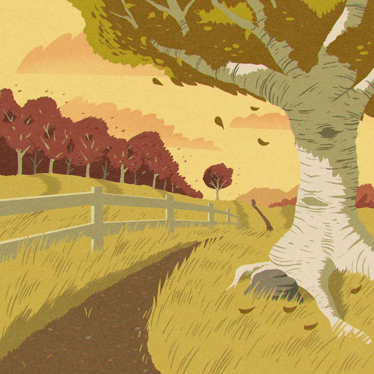
The first day of Inktober that really pushed my boundaries was “Path.”

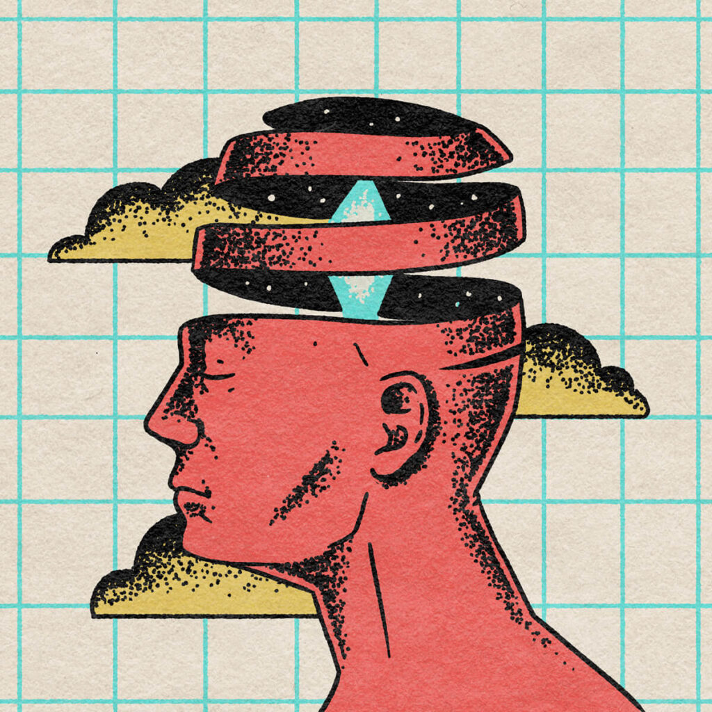
I tried to think of anything that wouldn’t just be a landscape or scene (something I don’t excel at), but when I realized I was trying to avoid this subject matter I knew I had to go for it. I also pushed myself to get weird for Dream, and simple for Plump.

Trying new styles
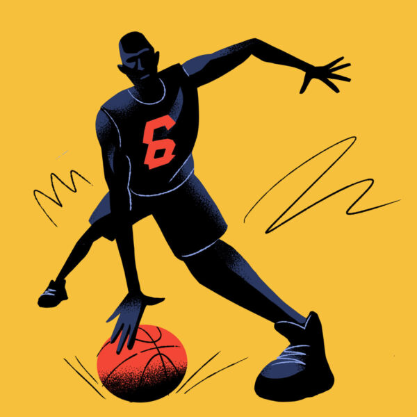
I approached many Inktober prompts with new illustration techniques that I had never tried before. I used shape carving for Bounce, which gave me a very dynamic pose.
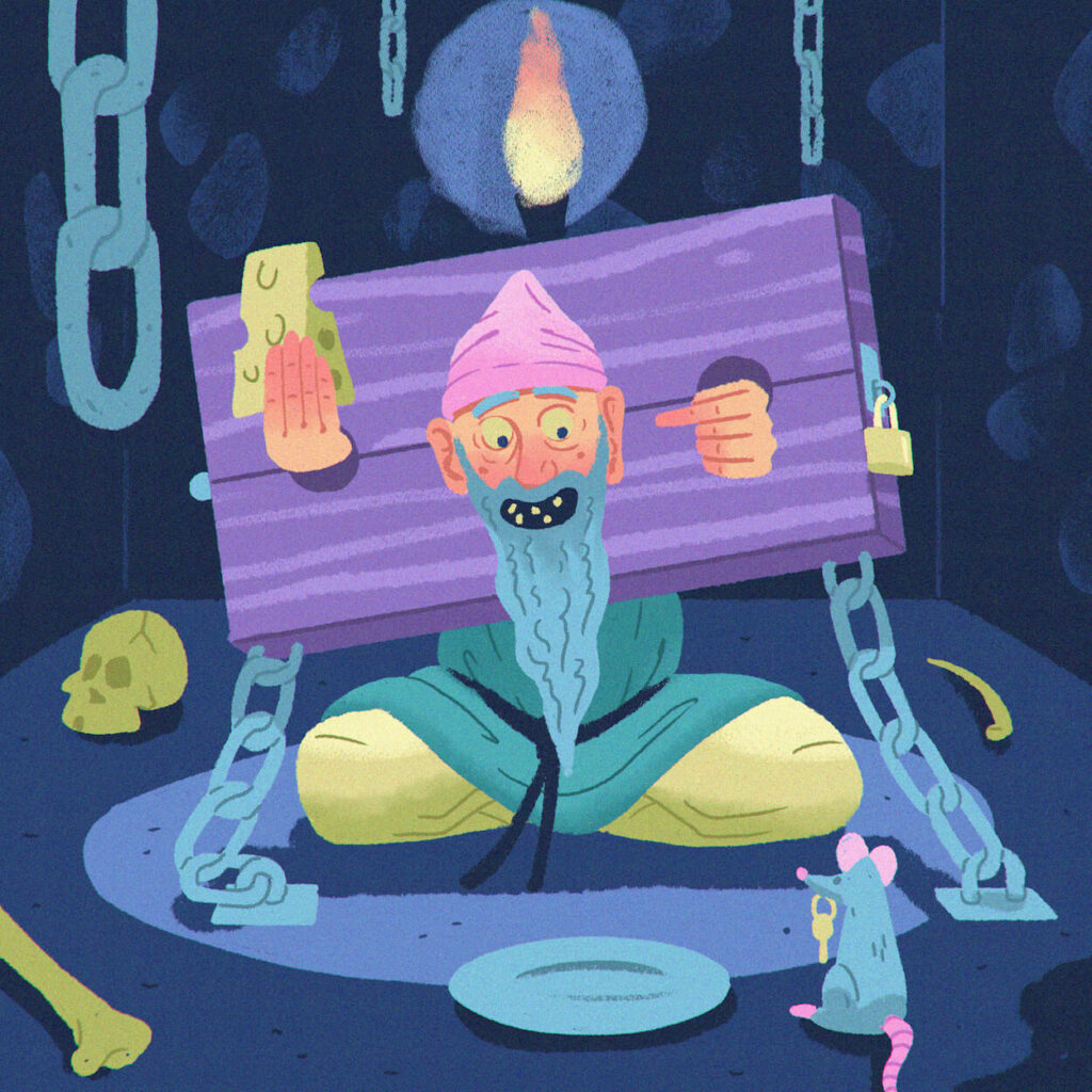
I went minimalist for Dagger, colorful for Chains…

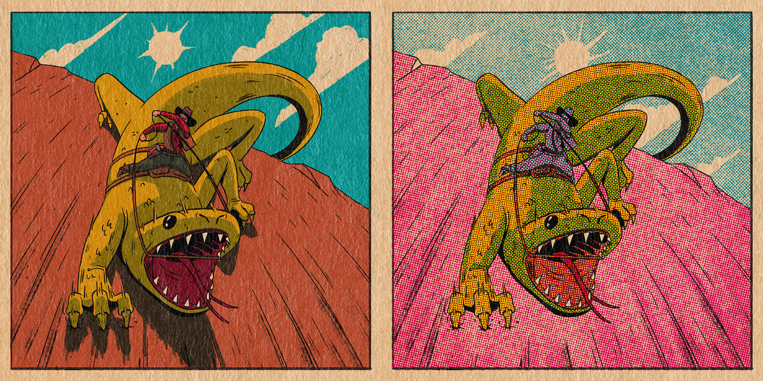
…and experimented with various rendering techniques on Saddle.
Pushing perspective
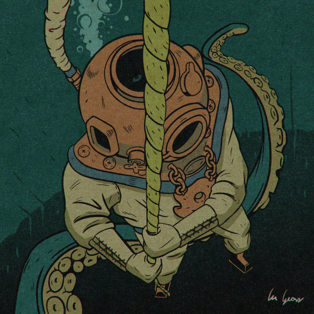
I spent more time on some Inktober illustrations than others, attempting a more dramatic angle or perspective than usual. This was most true for my illustration for Rise, which featured a downward angle on a vintage diver’s helmet: a deceivingly complex combination of shapes and angles. I also pushed myself on Saddle [above] to capture the dynamic movement of the lizard.
The advantage of versatility
Although I’m often envious of illustrators with a strong, consistent style, versatility has been helpful to me when collaborating on larger projects, such as websites or branding. I’ve been able to make visual choices that can fit a wide variety of clients or applications, which is a helpful tool for Dot Foundry projects.

Illustration can be a huge step in making a brand or website more fun and personable. Expensify‘s rebrand is a perfect example of using deliberate illustration to generate engagement with an otherwise dry subject. Contact me for a free consultation on what we can do for you!
